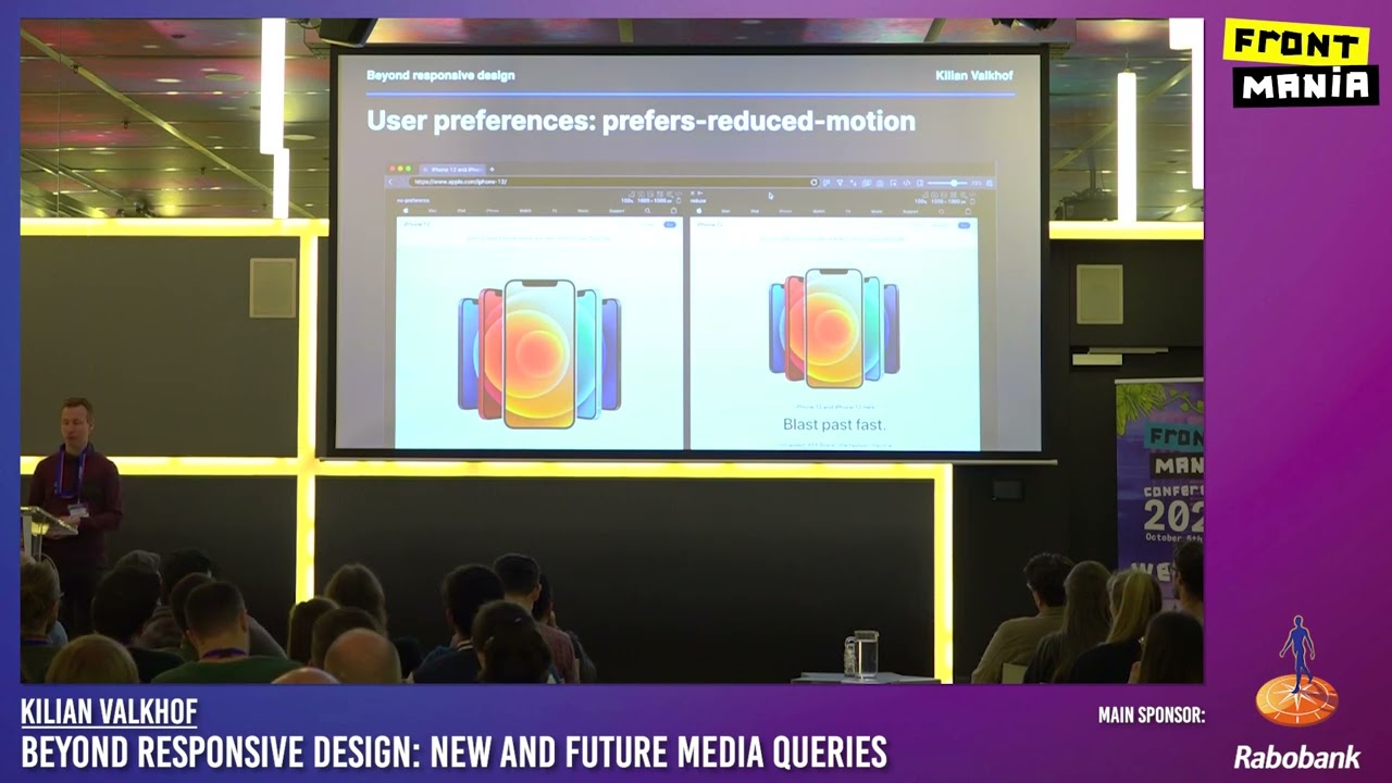
Frontmania 2022: Kilian Valkhof – Beyond Responsive Design: New and Future Media Queries
Responsive design turned 10 years old last year. Since then browser capabilities have changed a lot, and they’re set to change even more. We’ll explore new and upcoming media queries that will let website authors make websites that respond not just to screen sizes, but to many different user preferences and situations. Learn how to implement these in forward compatible ways with practical tips and examples.
(Visited 28 times, 1 visits today)


